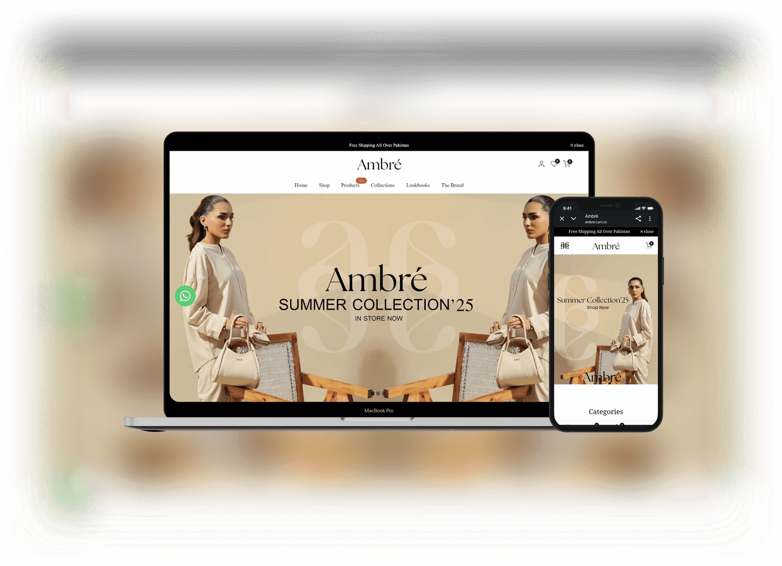
Visual Hierarchy
A refined visual hierarchy was established using soft, luxurious color tones, elegant typography, and high-quality imagery. Featured products, promotions, and call-to-action buttons were strategically emphasized to guide visitors smoothly through the shopping journey while maintaining a polished aesthetic.
Components
The Ambré store included a dynamic hero banner, curated collection sections, product sliders, testimonial blocks, and a responsive footer. Additional features like quick shop options, promotional popups, and detailed product pages enhanced usability, brand consistency, and overall customer experience.